Page 1 of 2
Redesigned SWARM deck in the works
Posted: Thu Jul 16, 2015 12:56 pm
by rjtomlinson1977
It was pointed out to me that the printer I used for Gettysburg and the Bradford County History deck had a staple deck that was 100% just like the Bee deck (except for the name of course). I brought this to their attention and the were very ashamed of this fact. They asked me if I would be interested in redesigning their staple deck to set it apart from Bee but at the same time keep a classic look. For the design I wanted to have the classic Red/Gold and Blue/Gold options like you see with Aristocrat Playing Cards, Bee Playing Cards, MPC Playing Cards and countless other staple decks. I also wanted to create a honeycomb shape in the middle that would interlock with other decks placed side by side. Here's what I came up with....
Re: Redesigned SWARM deck in the works
Posted: Thu Jul 16, 2015 1:04 pm
by ecNate
Much better from a design perspective, clean and modern look, but most critically it will allow it to stand on it's own without obviously hyper-mimicking another commercially successful deck. I still maintain their old look was lazy and similar to what generic/store brands do vs a rip off/clone, although it is one of the worst I've seen. Either way, this is the right direction, good work!
Prior:

Re: Redesigned SWARM deck in the works
Posted: Thu Jul 16, 2015 3:15 pm
by rjtomlinson1977
I added the words "Poker Size" to the top as it felt like it needed something. I also changed the number from 92 to 77 since 92 is associated with the Bee brand.
Re: Redesigned SWARM deck in the works
Posted: Thu Jul 16, 2015 6:32 pm
by sprouts1115
rjominson1977 - If you are throwing numbers out there, make it "69" Make the symbol look similar to this; they would never know.

Re: Redesigned SWARM deck in the works
Posted: Thu Jul 16, 2015 7:36 pm
by rjtomlinson1977
sprouts1115 wrote:rjominson1977 - If you are throwing numbers out there, make it "69" Make the symbol look similar to this; they would never know.

Yeah, they probably wouldn't know. I thought the owner of the company might appreciate 77 since He and I were born only two months and 1 day apart in 1977. I'm not sure if all these Numbers (for different decks mean anything) but at least 77 would have some meaning.
Re: Redesigned SWARM deck in the works
Posted: Thu Jul 16, 2015 9:51 pm
by rjtomlinson1977
Continuing with the honeycomb design on the back design. Simple but with classic feel. Might do slightly smaller... I don't know.
Re: Redesigned SWARM deck in the works
Posted: Thu Jul 16, 2015 11:30 pm
by volantangel
Mmm love that honey comb pattern, I wish the box had a little more character though, still MUCH better than the previous =)
Re: Redesigned SWARM deck in the works
Posted: Fri Jul 17, 2015 2:04 am
by Slavich
rjtomlinson1977 wrote:sprouts1115 wrote:rjominson1977 - If you are throwing numbers out there, make it "69" Make the symbol look similar to this; they would never know.
Yeah, they probably wouldn't know. I thought the owner of the company might appreciate 77 since He and I were born only two months and 1 day apart in 1977. I'm not sure if all these Numbers (for different decks mean anything) but at least 77 would have some meaning.
Robert why don't you incorporate number 8, as its their lucky number?

Re: Redesigned SWARM deck in the works
Posted: Fri Jul 17, 2015 4:08 am
by jsantafe
volantangel wrote:Mmm love that honey comb pattern, I wish the box had a little more character though, still MUCH better than the previous =)
I agree! I think the design is too geometrical, too clean, aseptic, if that's a thing
It would benefit from a few embellishments and details.
The back is great, and smaller makes it greater!
Re: Redesigned SWARM deck in the works
Posted: Fri Jul 17, 2015 8:25 am
by rjtomlinson1977
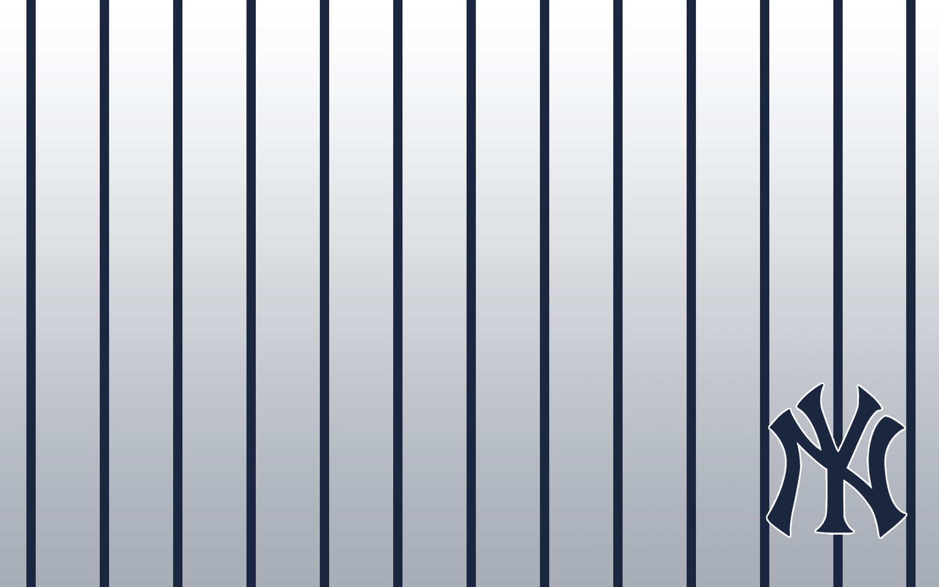
I agree the tuck is a little too clean but that's how most staple decks look to keep a timeless appearance. I may add some New York Yankee pinstripes to see if it helps feel in the void.
Re: Redesigned SWARM deck in the works
Posted: Fri Jul 17, 2015 3:31 pm
by rjtomlinson1977
Here's the updated blue deck with the pinstripes. The print company suggested honeycomb in the middle but I can't figure out the best way to do that yet. I also added a white border to the back because I don't think their registration is 100% perfect yet. But they are working on it... that along with the finish which I think is a lot better with the Bradford County deck I just had them do.
They just recently hired a new print manager, Mr. Dong (
), who comes from a big printing company. He's been working on improving their quality over the last month or so.
Re: Redesigned SWARM deck in the works
Posted: Fri Jul 17, 2015 8:05 pm
by MagikFingerz
Definitely looks better with the pinstripes. For the borders, maybe try a fade effect (Stinger borders)?
Re: Redesigned SWARM deck in the works
Posted: Fri Jul 17, 2015 8:20 pm
by sprouts1115
MagikFingerz wrote:Definitely looks better with the pinstripes. For the borders, maybe try a fade effect (Stinger borders)?
Have to agree with MagikFingerz. At least do a shading to the cut border. I'm in it to win it for no borders like the old "BEE" back. If you are looking for numbers try 15 or 16 honeycombs across with the Back. Take your pick...
Re: Redesigned SWARM deck in the works
Posted: Fri Jul 17, 2015 8:51 pm
by rjtomlinson1977
Yeah, Don Boyer from the other forum mentioned doing a fade away like the stinger back. I'll give it a try and see how it looks. I think it would look good too.
Re: Redesigned SWARM deck in the works
Posted: Fri Jul 17, 2015 9:28 pm
by sprouts1115
rjtominson1977 - What ever Don says is probably true. What if you put the small honeycomb in the center, It's probably small enough not to mess with the text "Swarn" Love the bee icon. And the lines look like the unused parts of the bee hive... simple. So, you are sticking with "77" and casino quality?
Re: Redesigned SWARM deck in the works
Posted: Fri Jul 17, 2015 10:12 pm
by rjtomlinson1977
The number 77 is solely up to them. It was just me tossing my hat into the ring. The Casino Quality is up to them also but the finish we did with the Bradford County deck was really good. I sent Joey from the Flush a deck and he was also impressed with the finish and handling. I still say on a scale from 1 to 10... USPCC, EPCC and LPCC is 10 but the Bradford County deck was a 9... while I would give the Gettysburg deck an 7.5 to 8 on the finish and handling. Personally as just a card user I find the 10 level a little to slippery (especially the USPCC decks). So judging on slipperiness I would say the others are better but not by much. I would actually say I prefer the Bradford County deck. Think of it like candy... USPCC and EPCC are too sweet for my blood while the Bradford County deck is just right.
I shaped the bee like the letter S for Swarm. I think it would show better if I moved the bottom wing up a little. The S on the Swarm could be modified into a bee but I thought it would look a little too tacky.
Re: Redesigned SWARM deck in the works
Posted: Fri Jul 17, 2015 10:34 pm
by rjtomlinson1977
Here's my first attempt at faded edges. I thought it would be easy to do but I guess there isn't any square gradients in illustrator. I'll work on it to see if I can get it better.
Re: Redesigned SWARM deck in the works
Posted: Fri Jul 17, 2015 11:01 pm
by volantangel
Im with the full bleed, its what the bees were defined on, plus i think its looks better =)
Re: Redesigned SWARM deck in the works
Posted: Sat Jul 18, 2015 6:26 pm
by rjtomlinson1977
Now on to the court cards. Of course, in the looks department you won't see much difference... but this was redone 100%. If you look close enough you'll see a few changes but mainly a cleaned up version of the Kind of Diamonds. The one on the left is what they're currently using and the one on the right is the updated one. Oh, yeah... I forgot to add his hand. That was a mistake. He'll have it back soon enough.
Re: Redesigned SWARM deck in the works
Posted: Sun Jul 19, 2015 5:16 am
by jsantafe
It's a huge improvement based on details. Buy isn't the burgundy a bit too brown? Original red is ugly, but for a staple deck, isn't it a bit too far from red?
Re: Redesigned SWARM deck in the works (wap)
Posted: Sun Jul 19, 2015 9:50 pm
by rjtomlinson1977
The colors are still up in the air. I personally like a darker red
Re: Redesigned SWARM deck in the works
Posted: Mon Jul 20, 2015 3:47 pm
by rjtomlinson1977
Here's the updated Kings for the Swarm deck.
Re: Redesigned SWARM deck in the works
Posted: Mon Jul 20, 2015 4:32 pm
by jsantafe
Maybe it's my screen or having the other figures around, but if you haven't changed the red, it looks much better!
Re: Redesigned SWARM deck in the works
Posted: Fri Jul 24, 2015 7:06 pm
by rjtomlinson1977
3 out of 4 updated Jacks... keeping with standard look with some modifications. For example, I didn't think the Jack of Diamond needed a flower poking out of his chest for no apparent reason so I got rid of it.
Re: Redesigned SWARM deck in the works
Posted: Sat Jul 25, 2015 4:24 pm
by sprouts1115
rjtomlinson1977 - Yea that flower was probably a leather strap to hold his quiver. Notice the half arrows on his chest. Get rid of those too. The JoD should just be holding some halberd weapon...
Re: Redesigned SWARM deck in the works
Posted: Sat Jul 25, 2015 5:55 pm
by rjtomlinson1977
Don Boyer suggested adding the flower or leather strap or whatever it is back to the design since a lot of card players have special nicknames for the cards. So, he said for a standard deck we shouldn't stray too far from the norm. Here's the updated Jack with his flower or whatever it is back. Also here's a work in progress view of the Jack of Clubs.
Re: Redesigned SWARM deck in the works
Posted: Sat Jul 25, 2015 8:10 pm
by sprouts1115
rjominson1977 - This is the earliest I could find it. This was before all the suit indicators were on the top left, before we had indices, and reversible courts, and even before rounded card edges. It's looking like it's just part of the design.
If you are worried about being traditional, The JoD just needs a court border with a fontal face toward the left. He needs a halberd type weapon on the right. I guess the Bicycle 808 is the standard. Everything else is just interpretation. Notice in the JoH, the hilt of his short sword turned into a leave. Things change over time...
I was wrong in thinking it was some sort of quiver and arrows.
Re: Redesigned SWARM deck in the works
Posted: Mon Jul 27, 2015 5:44 pm
by rjtomlinson1977
Here's the Queen of Spades. As of right now, I'm thinking of modified hairdos for the Queens.... unless people object.
Re: Redesigned SWARM deck in the works
Posted: Mon Jul 27, 2015 6:13 pm
by MagikFingerz
That's awesome, RJ. I think anything you can do to spruce them up without taking away traditional elements is a good way to go.
Re: Redesigned SWARM deck in the works
Posted: Mon Jul 27, 2015 6:30 pm
by sprouts1115
rjtomlinson1977 - Your KoD needs a hand. It's funny that the KoH is the only card with 2 hands. Let's have some fun. Have the KoD have two hands and have one on the axe. Let that hand extent out near the cut border outside the court border. While you are at it. Imagine what the Queens would look like if you extended the art pass the court border very close to the cut border. Complete the head on the Queens. Ever noticed how the QoH has less Red than the QoC and QoS.
